3 Most Popular Types of Forex Charts Used in Technical Analysis
Last Update: 17 December,2016Technical analysis is all about speculating price movements on the basis of historical price action, and the best way to gain knowledge of historical price action is by simply looking at the charts of any particular currency pair.
Currency Chart is a graphical illustration of the price action in a given time frame of a particular currency pair. A chart is the easiest way to analyze the current situation of the market. A chart is built in two coordinates; one is the vertical axis, which represents; the price of the currency pair and the other is the horizontal axis, which represents, the time frame of that particular currency pair’s price action.
Learning to read charts and how to use charts is the most important and basic step of technical analysis. Almost every professional trader uses chart to research and study market sentiments, and by combining the facts and figures, they are able to find the low risk opportunities.
The most popular forex charting and trading platform in the world is Meta Trader. Mostly all Fx brokers provide access to this software for live forex charting and trading absolutely free of cost.
The Three Most Popular Types of Charts are
1. Line Charts
2. Bar Charts
3. Candlestick Charts
Before understanding charts, let see what does “Time Frames” means and what are the standard time frames?
While trading and analyzing the currency market, in order to find the best opportunities for trading, you will very frequently hear the word “Time frame” and this word is also associated with charts because a particular time frame is required to plot the data on the chart.
Time frame is just a period of time, which is used, to build a chart as it displays the complete price action data for that particular period of time in a single bar and/or candlestick. The standard time frames available in all charting software’s are monthly, weekly, daily, 4 hours, 1 hour, 30 minutes, 15 minutes, 5 minutes and 1 minute.
We’ll now explore all these 3 types of charts, as how do they look, and how to read them?
Line Charts
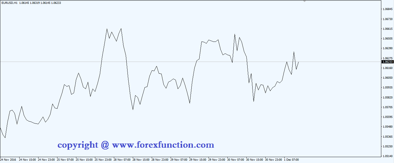
The simplest chart of all is this line chart. As the name says, it is the same; it is a chart with a single line, which is drawn on a series of dots i.e. from one closing price dot to the next dot of the closing price. Below is an example of a line chart displaying the EUR currency pair on 1 hour time frame.EURUSD Currency Pair – 1 Hour Line Chart

In the line chart above, you can see a simple and clear uncluttered line, which is reflecting the closing price of EURUSD on each day on the vertical axis and the dates on the horizontal axis.
Bar Charts
Bar chart provides more information than the line charts. A bar chart consists of a series of many vertical lines known as bars; a bar is nothing, but a single unit (single vertical line) as according to the time frame, whether it is a month, week, day, 4 hour, 1 hour and/or any intraday time frames.Formation of a Single Bar
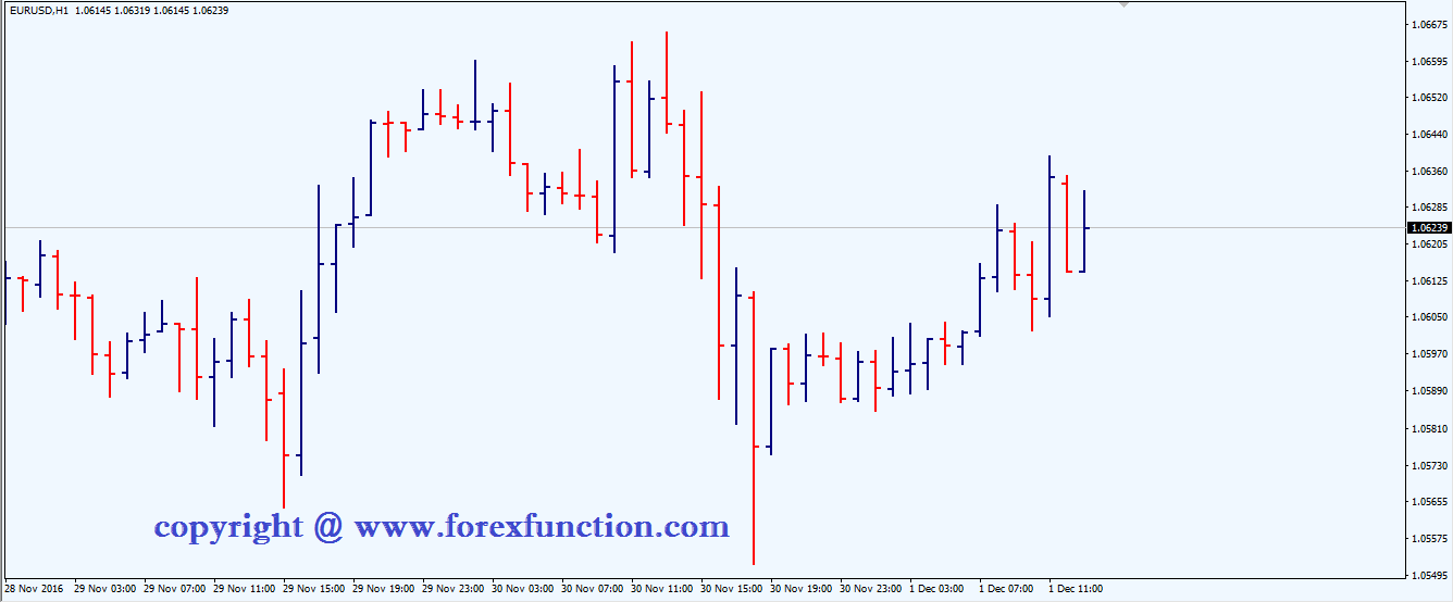
A bar reflects all the price movements of any given time period. A bar chart is also called and “O.H.L.C. Chart” because it displays the opening, high, low and closing price of the currency pair as according to the time frame. In the above picture, you can see the formation of a single bar.The whole height of the bar reflects the highest and lowest traded price; the horizontal dash on the left hand side is the opening price and the horizontal dash on the right hand side are the closing price. If the closing price is higher than the opening price, then it is called a Bullish Bar, and if the closing price is lower than the opening price, then it is called a Bearish Bar. Below is an example of a bar chart displaying the EURUSD currency pair on 1 hour time frame.
EURUSD Currency Pair – H1 Bar Chart

In the chart above, you can see a series of bars; each bar reflects a single day’s full trading activity from the highest traded price to the lowest traded price and also the opening price via left dash and closing price via right dash.
Kindly remember, whenever a word bar is used in the future, it means a single bar in reference to the time frame.
Candlestick Charts
Candlestick charts are the most beautiful charts as they display the price action in a graphical format instead of just dots and lines. We can also say candlestick charts as “Sexy Bodies” and “Skinny Shadows”.Formation of a Single Candlestick
Candlestick charts also displays the same price action data like the bar charts, but with a twist, for example; in the above picture, you can see the formation of a single candlestick. A candlestick shows the same price action i.e. the opening, high, low and closing price of a currency pair as according to the given time frame.The whole height of the candlestick reflects the highest and lowest traded price, now the twist here is the larger block (Real Body), which is in between the vertical line and its color; the whole larger block is the opening and closing price of a single time unit if the color of the real body is white or green, then it means that it is a Bullish Candle i.e. the closing price is higher than the opening price, and if the color of the real body is black or red, then it means that it is a Bearish Candle i.e. the closing price is lower than the opening price. The skinny vertical line above and below the body are known as shadows.
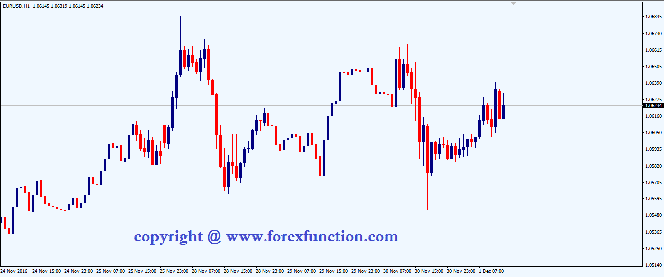
Below is an example of a candlestick chart displaying the EURUSD currency pair on 1 hour time frame.
EURUSD Currency Pair – H1 Candlestick Chart

In the chart above, you can see a series of candlesticks; each candlestick reflects a single day’s full trading activity from the highest traded price to the lowest traded price and also very easily we can understand by the color of the bodies that whether the day was bullish or bearish.
I personally prefer and use candlestick charts, as they are very prettier and I can easily understand the market activity without straining my eyes, further I also use colors instead of plain black and white, I use green color instead of white and red color instead of black.
A candlestick not only displays the price action in a beautiful and colorful format, but it also helps us understand the market in a better way than the bar charts via candlestick patterns. We will see all major candlestick patterns in the later lessons.
Submit Your Comments:
FOREX VPS FOR TRADERS
FF FOREX VPS
Windows 2012R2/2016 | Server Location Amsterdam, France, Canada | Low Latency From Brokers| Super Fast Trading Experience | All types of EA supported | 3 Days Money Back Guarantee
| Plan Name | Buy Link | CPU | RAM | Disk | BandWidth | Price (Montly) | Price (Quarterly) | Price (Semi-Annually ) | Price (Annually) | Installation | BackUp | Setup Fee |
| ECO-01 | buy now | 1 Core | 756MB | 18GB | Unmetered | $4.99/M | $4.49/M | $3.99/M | $2.99/M | MT4 Pre-Installed | Yes | Free |
| ECO-02 | buy now | 1 Core | 1GB | 22GB | Unmetered | $5.99/M | $5.49/M | $4.99/M | $3.99/M | MT4 Pre-Installed | Yes | Free |
| ECO-03 | buy now | 2 Core | 2GB | 30GB | Unmetered | $9.99/M | $9.49/M | $8.99/M | $7.99/M | MT4 Pre-Installed | Yes | Free |
| ECO-04 | buy now | 2 Core | 3GB | 32GB | Unmetered | $13.99/M | $13.49/M | $12.99/M | $11.99/M | MT4 Pre-Installed | Yes | Free |
| ECO-05 | buy now | 3 Core | 4GB | 40GB | Unmetered | $17.99/M | $17.49/M | $16.99/M | $15.99/M | MT4 Pre-Installed | Yes | Free |
| ECO-06 | buy now | 3 Core | 5GB | 45GB | Unmetered | $21.99/M | $21.49/M | $20.99/M | $19.99/M | MT4 Pre-Installed | Yes | Free |
***We accept Paypal, Perfect Money, Bitcoin !


